A referral program for online stores
Refericon is a SaaS platform for online stores. A customer refers the store to a friend, the friend buys at a discount, and the referrer gets a reward. We designed and built the store dashboard, the widget and the product landing page.
- UX/UI
- Web app
- Landing page
- Development
- Category
- Web
- Scope
- Web app
- Industry and model
- SaaS · B2B · E-commerce
- Technologies
- JavaScript, Laravel
- Website
- refericon.pl ↗
Challenge
Stores want customers to recommend them to friends. Without a tool, those referrals can’t be measured or rewarded.
A happy customer is a store’s best advertising, but there was no simple way to turn recommendations into a measurable acquisition channel, without a developer and without an ad budget to get started.
We designed Refericon from two sides: a dashboard where the store sets up and measures its referral program, and a widget through which shoppers refer the store to friends. One rule applied throughout: every step has to make sense without instructions.
Four steps to a referred purchase
The whole flow fits into four steps, just as simple for the store as for its customers.
- 01
The store sets a reward
A discount for the referrer and the referred friend, code validity and a referral limit per campaign.
- 02
It pastes one snippet
Step-by-step instructions for Shoper, Shopify, WooCommerce, PrestaShop, Google Tag Manager and custom websites.
- 03
A customer refers the store
They enter a friend’s email in the widget or copy their referral link.
- 04
The friend buys at a discount
They get an invitation with a discount code, and the referrer gets a thank-you reward.
The whole program in one dashboard
Everything the store sets up and checks after a campaign starts, with no spreadsheets and no need to ask a developer.
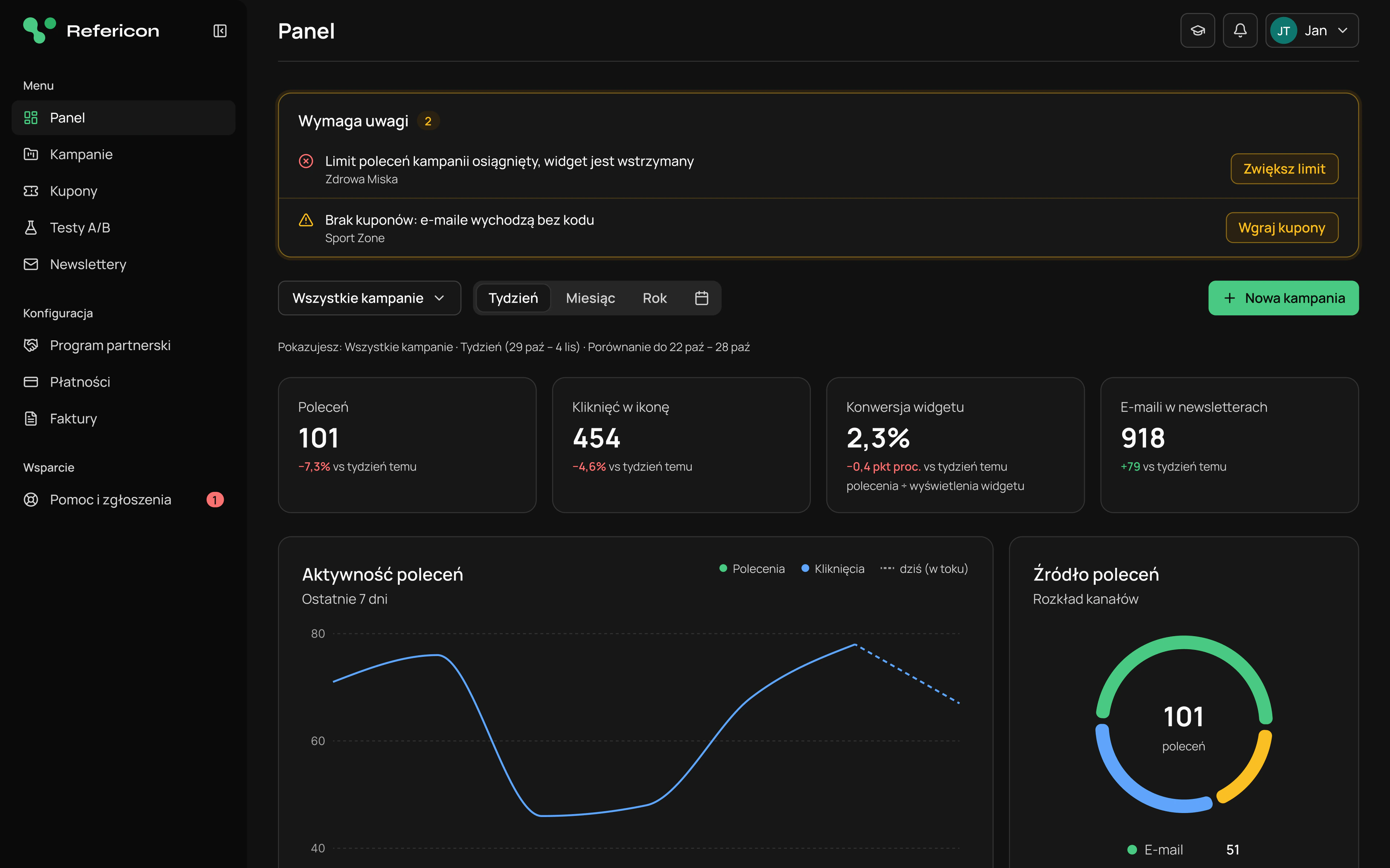
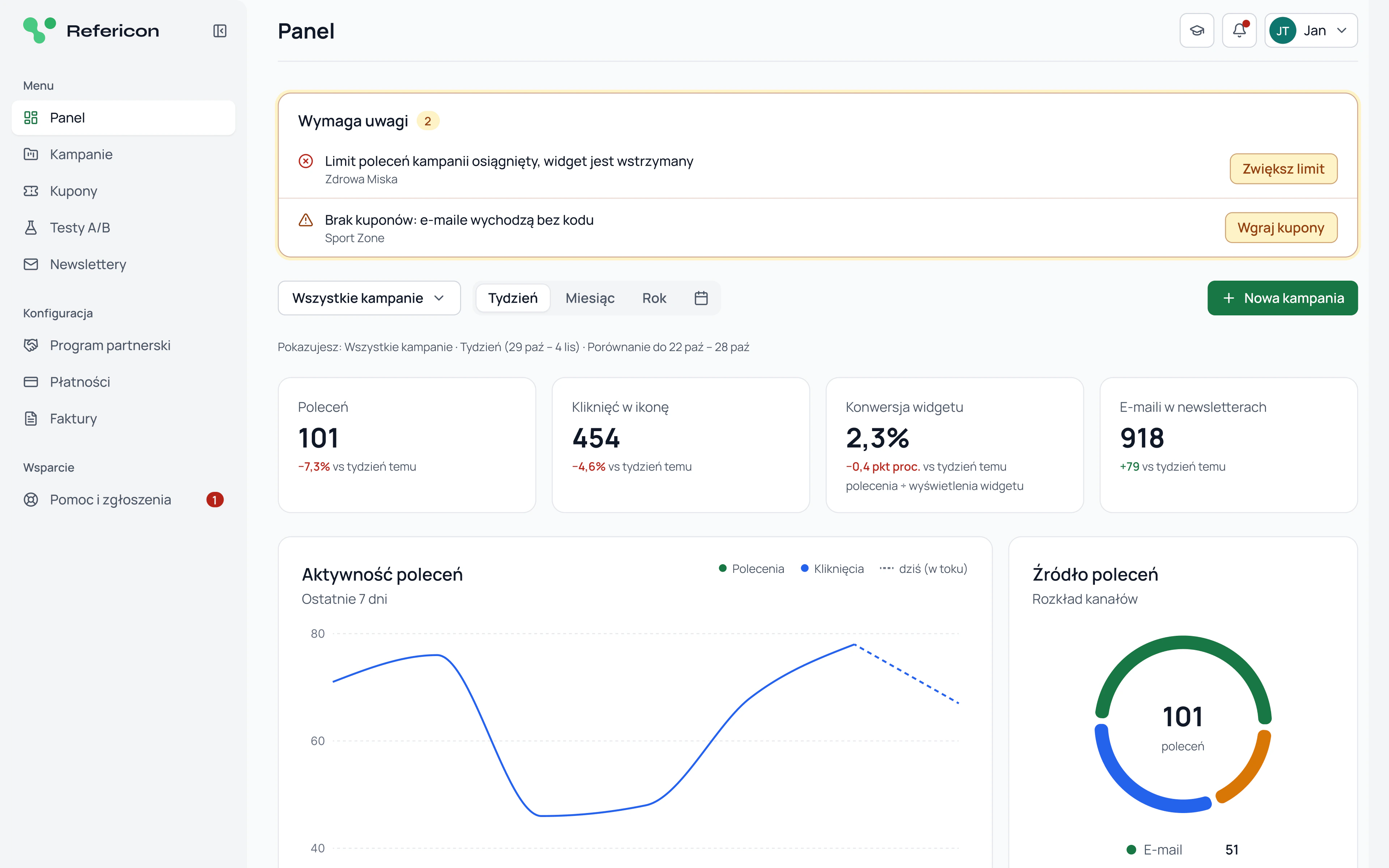
Dashboard and statistics
Referrals, clicks, widget conversion and collected email addresses, always compared with the previous period. A chart shows activity day by day, and next to it you can see where referrals come from and which devices customers view the widget on. Each campaign also has its own statistics.
Widget and reward
The store sets the widget’s logo, animation, style, colors and position itself, with a preview on its own website. In the same campaign it defines the reward: discount amount, code validity, code source and referral limit. A summary alongside shows what each side will get.
A/B tests
Two variants of a reward or copy run on real traffic, and each customer randomly sees one of them. The dashboard shows test duration, number of views and result confidence, and when there is too little data, it says plainly that it’s too early to decide.
Coupons and contacts
Discount code pools show how many codes are left, and the dashboard warns the store before referral emails start going out without a code. The store downloads email addresses collected through the referral program as CSV, with clear information on what those people consented to.
Light and dark mode
Every screen of the app and the landing page has both versions, built on shared color tokens. Drag the slider to compare.
 LightDark
A landing page that sells the product
The product page takes the store from a comparison with paid ads, through installation and a revenue calculator, to choosing a plan.
Landing page on mobile
The mobile version in both modes, with the same content order as on desktop.
Scope of work
UX/UI
Store and shopper flows: dashboard, widget, campaign wizard and landing page in light and dark mode.
Development
A web app in JavaScript and Laravel, plus installation on popular e-commerce platforms.
Launch and maintenance
Launching the platform as SaaS and developing it further.
Want a similar project?
Tell us about your idea and we will get back to you with specifics.